 |
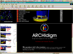
<-This is our original ARCHIdigm layout as per our 1st publication on September 15th 1997. |  |
||
 |
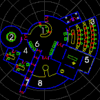
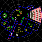
In June 1998, the original concept of using a map for navigation was modified and enhanced. The new navigation design demonstrates how a plan can be designed to highlight rooms as the cursor passes over their respective names. | Though ARCHIdigm is a consulting and training business, this site is about more than self-promotion, it is about creating a place for those using CAD (particularly AutoCAD®) in and around architecture. It is based upon an idea about building better tools by sharing better solutions . The industry created the catalyst, we created a space and now you can provide fuel. We will continue to contribute information that we gather. | ||
 |
In order to achieve the "image swap", a JAVA script had to be employed that would basically swap two images simultaneously; both the room label and the image map. In essence, the entire map is reloaded, with a specific room highlighted, as the cursor passes over the respective room labels. This process requires all swapping images to be loaded before use and can thus bring a WEB site to its knees rather quickly. In this case, 8 maps of 4-5KB are loaded and 16 navigation buttons (8 on and 8 off) of 1KB each. | |||
 |
If the images
were smaller, the individual room renderings would also
have changed as the cursor passed over the room labels,
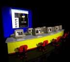
but faster modem speed will have to come first. These room renderings are the actual rooms from the map and were created fairly easily. Everything was created in AutoCAD R14. The original renderings were also done in AutoCAD, but on this second re-design, we used 3D Studio Max 2.0. The models were exported as .3ds files and then imported into 3D Studio Max. Photoshop was used to make finishing touches and bring the file sizes down for feasible use on our site. The images are about 145pixels sq. , 96dpi and palleted 8bit .GIF's (256 color and no dithering). |
|
||
 |
This logo was created and rendered in AutoCAD R14 and is set up to be a ubiquitous link between the Coverpage and any page you may be on. | |||
WEBsite ? |
When we started, we knew absolutely nothing about WEBsite design so we experimented with "raw" HTML coding, FrontPage™ and PageMill™. In the end, FrontPage revealed itself to be the best choice because of the "extensions" available with it that allows for such features as authorization based access. FrontPage is actually more than just an HTML editor, it is also a site server that can publish and manage a WEBsite. | |||
reading... |
One
of the most helpful books we used and will thus
recommend, is Microsoft FrontPage™ 97 Unleashed
by William R. Stanek - published by Sams.net. It was
both basic enough to be helpful when getting started and
advanced enough to be of use to this day. For more advanced features, such as JAVA scripts that flip images and so forth you can look at the source code of any site and begin the reverse engineering process. |
|||